
Trading for Beginners: Candlesticks
Starting out on crypto trading platforms can appear daunting to the uninitiated. However a few simple lessons can demystify the experience and reduce the risks associated with trading. This article looks to simplify trading charts to help explain candlesticks.
It is the first in a series of articles to help you trade.
After registering, which can take time depending at what stage the exchange performs its “Know Your Customer” (KYC) processes, the first thing to do is not to put money in the account but to explore and learn the core features of the exchange.
So let’s begin. Cryptocurrencies are traded in pairs, either with Fiat (Euros, Dollars, Pounds or other currencies) or other crypto currencies.
Quite often the exchange will have it’s own currency like Binance’s BNB coin.
Just remember these exchange coins are just as volatile as other cryptocurrencies with many experiencing explosive daily growth and big drops. Trading with the exchange’s own coin does come with some benefits, the best of which is the reduced trading commission fees.
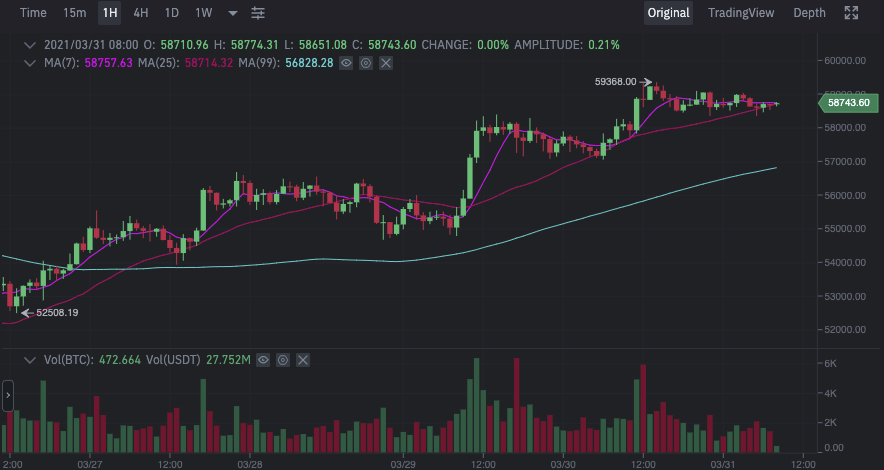
The first view that you may come across in figure 1 above can appear complex to the uninitiated but is really quite simple to understand. This is a candlestick chart, and it shows the sum of trading for that particular coin pair over a time period. Figure one above, shows the BTC/USDT hourly trading chart.
Ok, lets break down the chart into bite size chucks so you can understand whats happening here.
Setting the Zoom

At the top of chart, you can select the time increments at which you want to view the trading action (think about zooming in & out for more detail). In this example we are viewing in hourly increments. So each coloured bar, candlestick in the chart represents an hour of trading action.
Traders alternate zoom settings to look for larger or small trends developing for the pair to try to understand/predict the price action. Traders look for certain patterns that have historically correlated with market behaviour. We will cover some of these patterns in our next update.
Candlesticks
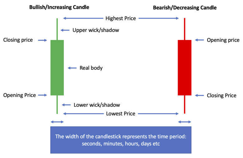
Figure 3 covers a candlestick and what each part means.
Green candlesticks represent positive price action which shows price is going up, a bullish move. A red candlestick shows the price going down over the hourly period, a bearish move. Each candlestick contains a lot of information and helps traders detect patterns in trading behaviour.
To help better illustrate the power of candlesticks our hourly candlestick in this example summarises trading action from 10:00am to 11:00am. Looking at the increasing candlestick, we start with the top vertical line, (the upper wick) which shows the highest price the pair traded at between 10:00 and 11:00 that day. The lower wick, represents the lowest price the pair traded at during the same time period.
The bottom of the body shows the opening price at 10:00 and the top shows the closing pricing price at 11:00. With the bearish candlestick, this is reversed with the opening pricing at the top and the closing price at the bottom.
Volume
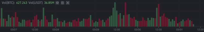
Under the candlesticks chart in this trading example we seeing trading volume (the total amount of money exchanged) over the same time period as the candlestick chart. Primarily it lets you see momentum over the period for the pair. Is it positive or negative? Positive in this instance means more buyers, where red means more sellers.
I hope you found this article useful. Happy and safe trading!